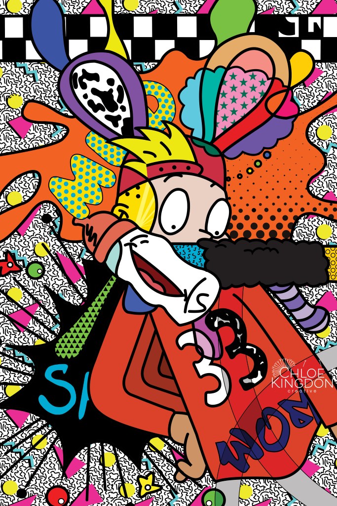
NOSTALGIA
ABOUT:
This piece started out as an assignment, but quickly turned into a passion project. I took a class called Computer Imaging in the Spring of 2019. I’m not sure what I was expecting. Maybe I was expecting that I would be taking another Photoshop or Illustrator class, but what I ended up taking was something completely different. You see, I took Computer Imaging with one of it’s most unlikely professors. It was taught by an art professor who is also an esteemed artist in the Jacksonville area and beyond. I was challenged to use the programs I was well acquainted with in ways that I had never been done before. For this assignment, I was challenged to create an original piece of art using Photoshop. I had previously done photo manipulations in Photoshop before, but I had never created something like this. I was overwhelmed about how I would use Photoshop as a blank canvas, but I figured if I was going to create something amazing and original, I would need to pour my heart and soul into it.
I wanted this piece to portray a feeling of nostalgia. Some of my favorite memories as a child include watching cartoons in the late 90’s and early 00’s. I spent three very long weeks working on this piece which was ultimately created for myself and myself alone. I am absolutely in love with this piece and I’m incredibly proud of it. There are a few imperfections that I’ve come to love as well. I entered it into a juried show and won 2nd place with this piece as well as a memorial purchase award. I found it liberating to create for myself.
Program(s) Used: Adobe Photoshop
Dimensions: 11 x 17 inches
TRAVEL CAMPAIGN

ABOUT:
One of my favorite things to do on a Friday night in is binge watch period dramas. One of my favorites is Downton Abbey. I created this project as a mock travel campaign to the Downton estate. Being that Downton Abbey is a fictional place, I was posed a bit challenge. However, I was able to use my imagination and dive right into this project. I had an absolute blast doing so! I focused on portraying the time period and used sepia tones to convey a sense of age. In addition, I used a serif typeface along with minimal use of a script typeface to help portray the sophistication as well as grandeur of Downton Abbey.
Program(s) Used: Adobe Photoshop and Adobe Illustrator
Dimensions: 8.5 x 11 inches
MOTION GRAPHIC POSTCARD
ABOUT:
One of my favorite places I’ve visited is the Caribbean. The sunshine, the crystal clear water, powdery white sand… it just exudes relaxation! So, when I was tasked with creating a motion graphic postcard representing a place I have visited, I knew I had to use the Caribbean.
Program(s) Used: Adobe After Effects
Dimensions: 1920p x 1080p
IMPOSTER SYNDROME VS. DUNNING-KRUGER EFFECT

ABOUT:
“Professional success usually comes as the result of effort, training and skill development but our own thoughts can help or hinder us as well. Two concepts connected to this are Imposter Syndrome and the Dunning-Kruger effect. ” Imposter syndrome can be defined as a collection of feelings of inadequacy that persist despite evident success. ‘Imposters’ suffer from chronic self-doubt and a sense of intellectual fraudulence that override any feelings of success or external proof of their competence. Whereas, the Dunning-Kruger Effect can be defined as a cognitive bias in which people with low ability at a task overestimate their ability. It is related to the cognitive bias of illusory superiority and comes from the inability of people to recognize their lack of ability. In this piece, I depicted a woman who portrays aspects of both sides.
Program(s) Used: Adobe Illustrator
Dimensions: 18 x 24 inches.
SEANOTE CONSTRUCTION COMPANY
ABOUT:
I created this logo for a client who is in the beginning stages of building their company. I had a lot of fun working to discover exactly what this client needed. Everything they wanted for their company was unconventional in regards to typical construction companies. The client wanted a logo that not only portrayed their company, but also themselves as an individual. The client wanted to portray two main ideas: that the company is woman owned and that it is Florida based. The client wanted their logo to feel unique and feminine, but subtly so. During the brainstorming phase of the creation process, I sketched many designs for Seanote Construction. I sketched designs using different Florida themes from palmettos to sea oats. When I posed the idea of using marine life in the logo, the client became very excited. I took the idea and came up with the seahorse and hammer logo and the client absolutely loved it.
Program(s) Used: Adobe Illustrator
Dimensions: Varied
CHLOE KINGDON CREATIVE
ABOUT:
What a challenge it is to look inward and realize you need to create something that accurately and honestly depicts yourself to others. That’s exactly how I felt during the design process for my own personal logo. I wanted to portray myself as a professional, but also as an individual as well. I started by listing qualities about myself: I’m feminine, a bit of a free spirit, I tend to pretty positive, and I’m always hopeful. When I thought of these attributes about myself, I thought of a dandelion. A dandelion is thought to represent wishfulness, warmth, and happiness which I found extremely fitting. In my logo, I placed each part of the dandelion individually and in an unstructured fashion to feel organic. I used a sans-serif font to represent myself as young and modern. I used the typeface in my name to represent femininity and creativity.
Program(s) Used: Adobe Illustrator
Dimensions: Varied
RESTAURANT MENU REDESIGN


ABOUT:
I completed this menu redesign as a school project. We were challenged to choose a restaurant we love and completely redesign the menu. I chose a Cuban restaurant in the Tampa Bay area that I love and got to work. The original menu was a jumbled mess of pictures, descriptions, and the layout needed to be reorganized. The original menu had both pictures as well as full descriptions of each menu item. I decided I needed to choose between pictures and the descriptions because both made for a cluttered menu. I prioritized descriptions over pictures because they give the customer a more precise idea of the dish they might be ordering. As for the color scheme, I took inspiration from their logo. I added a sunset and palm trees in the background to accentuate the island of Cuba, but I kept it subtle to limit distraction.
Program(s) Used: Adobe Illustrator
Dimensions: 8.5 X 14 inches
EVENT CAMPAIGN
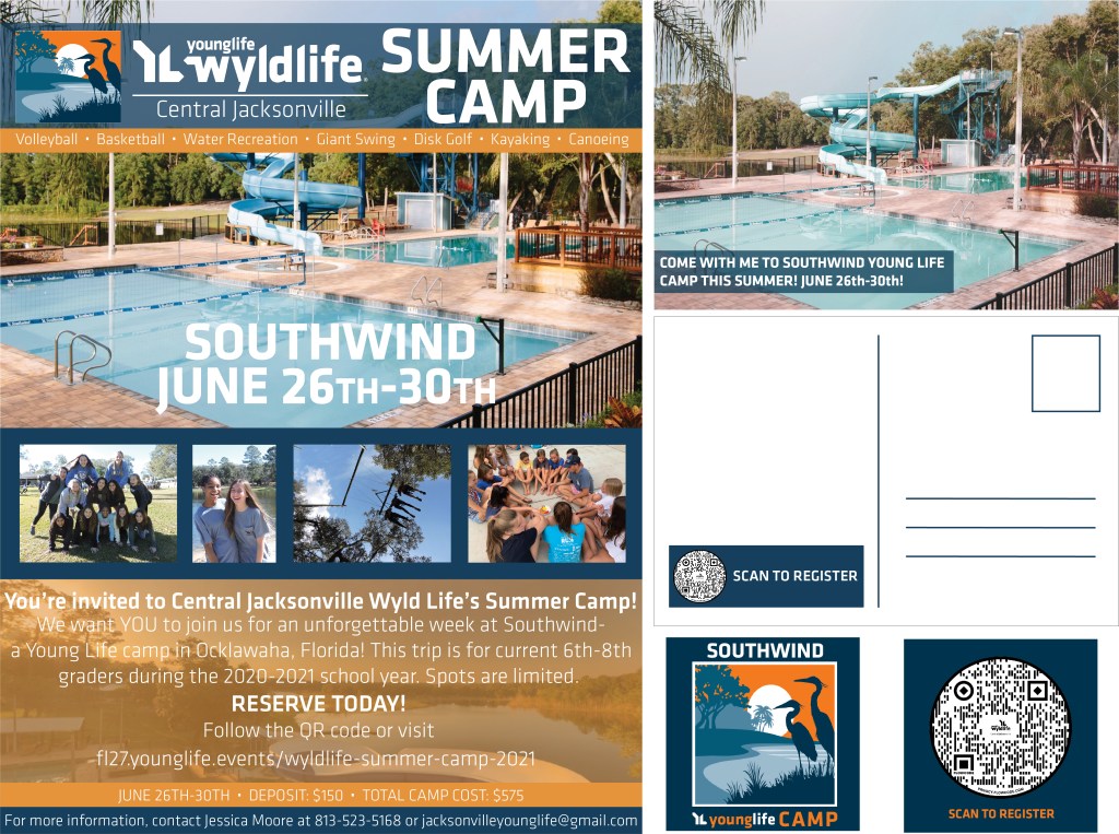
ABOUT:
I created this event campaign during my time as a Graphic Design Intern with Young Life. For the event campaign, I made a one page flyer, a double sided postcard, and a double sided QR card. I had a lot of fun utilizing my creativity to create this campaign! I utilized colors in the camp’s existing vector graphic to create uniformity throughout each document. The biggest challenge I faced was not overloading the flyer with information. I wanted to include quite a bit of information without the flyer feeling cluttered. I worked through that challenge by utilizing pictures to tell a story instead of only utilizing text. I love how successfully this campaign turned out!
Program(s) used: Adobe Photoshop and Adobe Illustrator
Dimensions: Varied
ANNUAL UPDATE

ABOUT:
I created this Annual update during my time as a Graphic Design Intern. I was given free reign, besides upholding brand guidelines, with this project. The report was relatively brief, so I knew making it visually appealing was important to capture the readers’ eyes. The response to this report was very positive and I’m so happy with the outcome.
Program(s) used: Adobe Photoshop and Adobe Illustrator
Dimensions: 8.5 X 11 inches
VISUAL IDENTITY
ABOUT:
For this project, I was tasked with creating two perspective logos for a company mockup. The company The mock company, Vida Meals, provides meal prep services for a variety of dietary needs. They requested warm tones to be used in their logo options. Upon research, I focused on the idea that food fuels your body and gives you energy. While brainstorming with the idea of energy, I couldn’t take my mind off of another energy source: the sun. The sun allowed plants to grow, is a source of power for cooking food, and allows our bodies to metabolize Vitamin D from our diets. It plays such an important role in life and is a key factor of health. So, I focused on the sun for the logo concepts. Both logo concepts use a combination of warm and cool colors for their color palettes and use a sans serif typeface to portray Vida Meals in a way they wish to be represented.
Program(s) Used: Adobe Photoshop and Adobe Dimension
Dimensions: Varied
MOCK PANDEMIC RESPONSE CAMPAIGN
ABOUT:
For this assignment, I was tasked with choosing a company I am familiar with and creating a mock campaign in response to the COVID-19 pandemic. I chose Winn Dixie supermarkets. In designing the campaign, I wanted to helping customers to feel safe and comfortable when having to do inevitable shopping during the pandemic. I created a slogan “checking every box” in response to a campaign material geared towards making sure every precaution is taken to ensure customer safety. I added the slogan to the existing logo, created store signage with information regarding safety measures, a mailed coupon, stickers placed on sanitized high-touch areas, as well as a T-Shirt design.
Program(s) Used: Adobe Illustrator and Adobe Dimension
Dimensions: Varied
